TU Delft Library Launched a New Website (and Here’s What We Learned!)
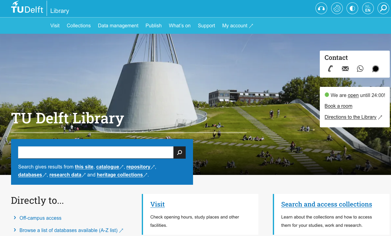
Big things have been brewing at the TU Delft Library — and we’re excited to finally share it: we’ve launched a brand-new website! 🎉 Starting today, we have an MVP (minimal viable product) of our shiny new site ready (check it out) — and we learned a lot along the way.
Lesson 1: The User Comes First — Always
From the start, we committed to designing from a user perspective. That meant asking tough questions, testing assumptions, and — yes — sometimes letting go of parts of the old website we were attached to. Even though we received certain requests over time (what to add on the homepage, what to add in a ‘top three’) we only did this when it rimed with our vision. This might have surprised some people looking at the new website. However, serving our users’ needs is part of the TU Delft Library website project team’s goal and we will continue to commit to it:
The Library website provides access to trusted knowledge and services to help visitors to get their work done and inspire them along the way.
We conducted extensive user testing throughout the development process. This helped us gain valuable insights into user expectations for a modern library website. Users expressed a strong preference for intuitive navigation, task-specific content, and streamlined access to services.
One of the key outcomes of this research was the introduction of a design framework based on concepts such as ‘Journeys’ and ‘Recipes’. This approach allows users to follow logical, goal-oriented paths through the site.
The result? A website that is easier to navigate, with clear wayfinding that helps users quickly locate library services. The design includes tailored user journeys based on specific tasks—for example, a dedicated path for PhD candidates working towards their thesis.
Additionally, the website now presents a clearer definition of our services, with content that is structured to be easily understood not only by users but also by search engines and AI agents, enhancing discoverability. Finally, we have decreased the number of pages of the website a lot: we went from 285 to 115 pages , which makes it easier for visitors to get their job (See; we’re committed to our vision!) done, and easier for us to maintain the website. A win-win!
Lesson 2: Teamwork Makes the Dream Work
This website was built by a large and diverse team of designers, developers, content specialists, communications specialists, UXers, a technical content manager, student assistants, and more — all working together, learning from one another, and (importantly!) having fun. Although the composition of the team has changed over time, everyone has put their hearts into this project and we are very happy to have learned from you all.
We learned that we only move forward when we truly collaborate. This also means working physically in the same room, starting the week together as a team and helping each other where needed. When we listen, support each other, and embrace the chaos with a sense of humor, magic happens.
And, obviously, we wouldn’t have made it without the amazing experts who brought their skills, insights, and care to this project. Just a few shoutouts (and I know I’m missing a lot still):
- UX: Dilay and Rosie guided us in understanding how users think and feel. Their creative minds designed the most beautiful and user-friendly designs, and they did this with a lot of interest in and respect for what the users need.
- TCM (Technical Content Manager): Inge worked miracles behind the scenes to bring everything together. Additionally, she was an inspiring, supportive and patient leader, guiding the SA’s and making sure all editors knew how to maintain the pages in the right way.
- Content: Anne helped shape our information in a way that’s clear, accessible, and actually helpful. Her critical mind, positive attitude and creative pen helped eliminating all extra content and develop something beautiful.
- Product Ownership: Rachel connected with each of the above, listened to their concerns, and brought everything together with persistence, intelligence and good humour.
Lesson 3: The Work Is Never Done
As we explained, we are live with our MVP: Minimal Viable Product.
A website isn’t a one-time product; it’s an evolving platform. We know we still have work to do and we will continue building on the website to make sure it will always suit users’ needs.
The management of the maintenance and development of the website lays in the hands of the website board: Inge Geuzebroek, Dilay Sarpay, and Isis Spuijbroek will continue working on improvements, adding features, fine-tuning the content, and listening to user feedback. The site will grow and change, just like our community does.
To maintain the quality and coherence of the website over time, we are putting in place a sustainable editorial process. This includes regular content reviews, adherence to the style guide, and ongoing meetings for editors.
Additionally, to ensure long-term sustainability and consistency, we have established clearer rules for editing and maintaining the website. This includes the development of:
- Editorial Guidelines to support content creation,
- A Style Guide to maintain a coherent tone and visual identity,
- A way of working for the website board.
- A way of working with so called ‘satellite’ websites, which are not necessarily 100% part of the library but are still connected.
Overall, creating a balanced approach that allows freedom of expression while ensuring the overall style and content remain cohesive and manageable.
Come Explore!
We invite you to explore the new TU Delft Library website, discover what’s new, and let us know what you think,
And to everyone who helped bring this to life — thank you. Truly. You’ve helped us build something we’re proud of.
See you online (and hopefully in the Library too!)
– The TU Delft Library Web Team (Inge Geuzebroek, Dilay Sarpay, Anne van der Laan, Rachel Flier)