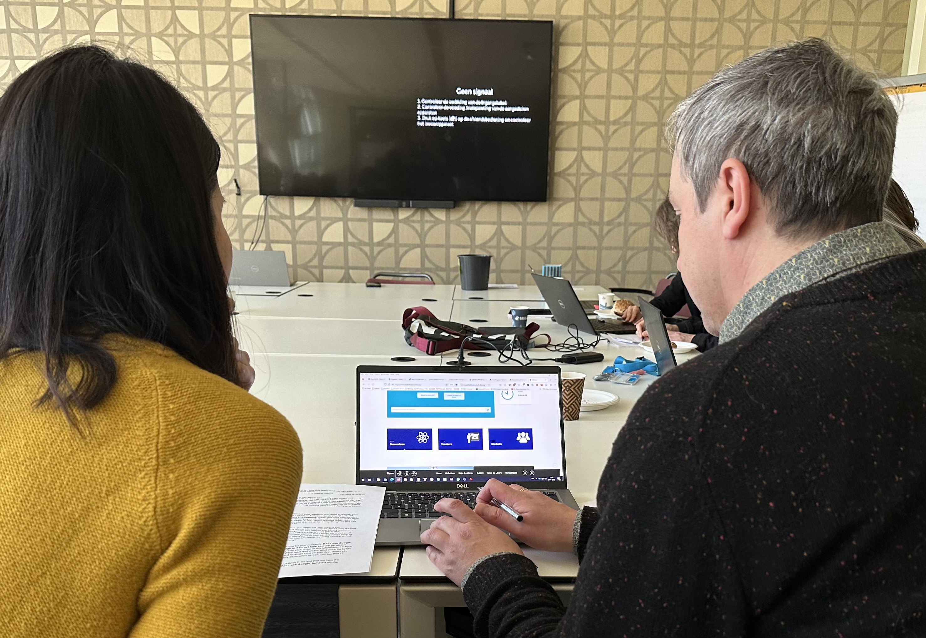
At the beginning of this year, two workshops took place with library staff to discuss the future of the TU Delft Library website(s) and to gain insight into the usage and needs of the users.
The aim of these workshops was to inform staff of the work on the TU Delft Library website project and
- To have them experience some of the challenges with the current website first-hand,
- To discuss the principles behind the TU Delft Library’s digital channels.
1. Experience current issues first-hand
After sharing some interesting statistics about the use of our library website, the staff got to experience some of the current issues of our website first-hand. While some of us were acting as students looking for the current river map of the Netherlands, others were researchers looking to fund their research, or publish a book open access. For some, trying to find a news item presented challenges.
After trying it out, the participants shared their experience and feedback. The most heard issues and tips were:
- There is too much information, especially pages like, the landing page for researchers show far too much text in the buttons in a not so readable font, which makes it hard to quickly find the relevant information.
- Too many clicks before you can find the right information. Google is much faster than navigating through the website. Luckily most information was found very quickly through Google, with some exceptions.
- The TU Delft logo in the header of the library website brings the user to the general TU Delft website homepage instead of the Library homepage. This was unexpected and caused people to get lost.
- The ‘Search this website function’ did not work like Google or other search engines. It gave unexpected results (when searching with multiple keywords), or even none when searching in English. Some questions came up: “Which pages am I searching through?”, “What is the search logic behind it?”, “Why are there no results?”
- “There are so many different ‘boxes’ to search in the collections, how do I know which one to use?”
- “You lose so much valuable space with the visual banner at the homepage, is it worth it?”
- Make use of visual language like icons and images to support easy scanning of information.
- There are no clear cues for important buttons and links to external webpages.
- “I see student, researcher, teacher, but as a PhD candidate which do I choose to find the information and support that is relevant for me?”
- There is no central place for news items. And when you search for news, you find a lot of outdated items from years ago.
- There are so many different headers and menus. Choose the best template and implement consistently.
- “The only consistent thing is the man with the beard popping-up in all the photos.” Let’s show more diversity in the images.
While some of these issues could already be tackled in an update of the current website, most will be taken on in the library website redesign project the coming year.
2. Discuss the principles behind the library’s digital channels
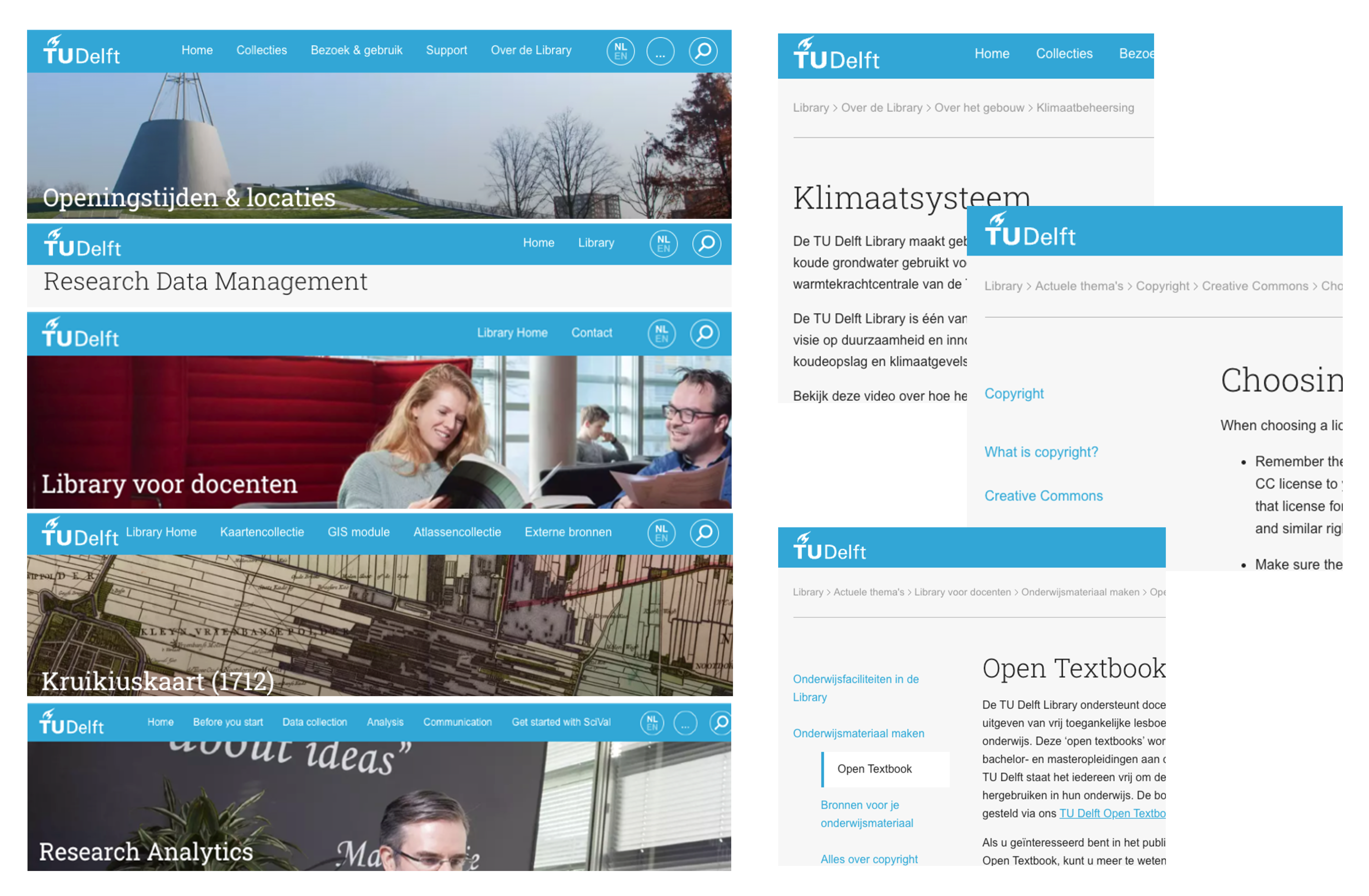
In the second part of the workshop we zoomed out to a bigger picture of the library’s digital channels. There is the central library website at tudelft.nl/library, but we also manage many other (sub)sites, such as Academic Heritage, and New Media Centre. In fact, when we look at our services, they tend to sit on three different places:
- On our central TU Delft library website – Hosted on tudelft.nl/library/ and delivered by Typo3
- On a subdomain of TU Delft website – Hosted on subdomain.tudelft.nl (or .com) and delivered by WordPress or another platform
- On a separate domain – Hosted on any other domain and delivered by any type of platform
In addition to these three channels, we also promote our services on TU Delft websites managed by other organizational units and social media. We also offer different type of content through community tools like wikis and blogs. As such, we have a broad palette of digital channels to manage.
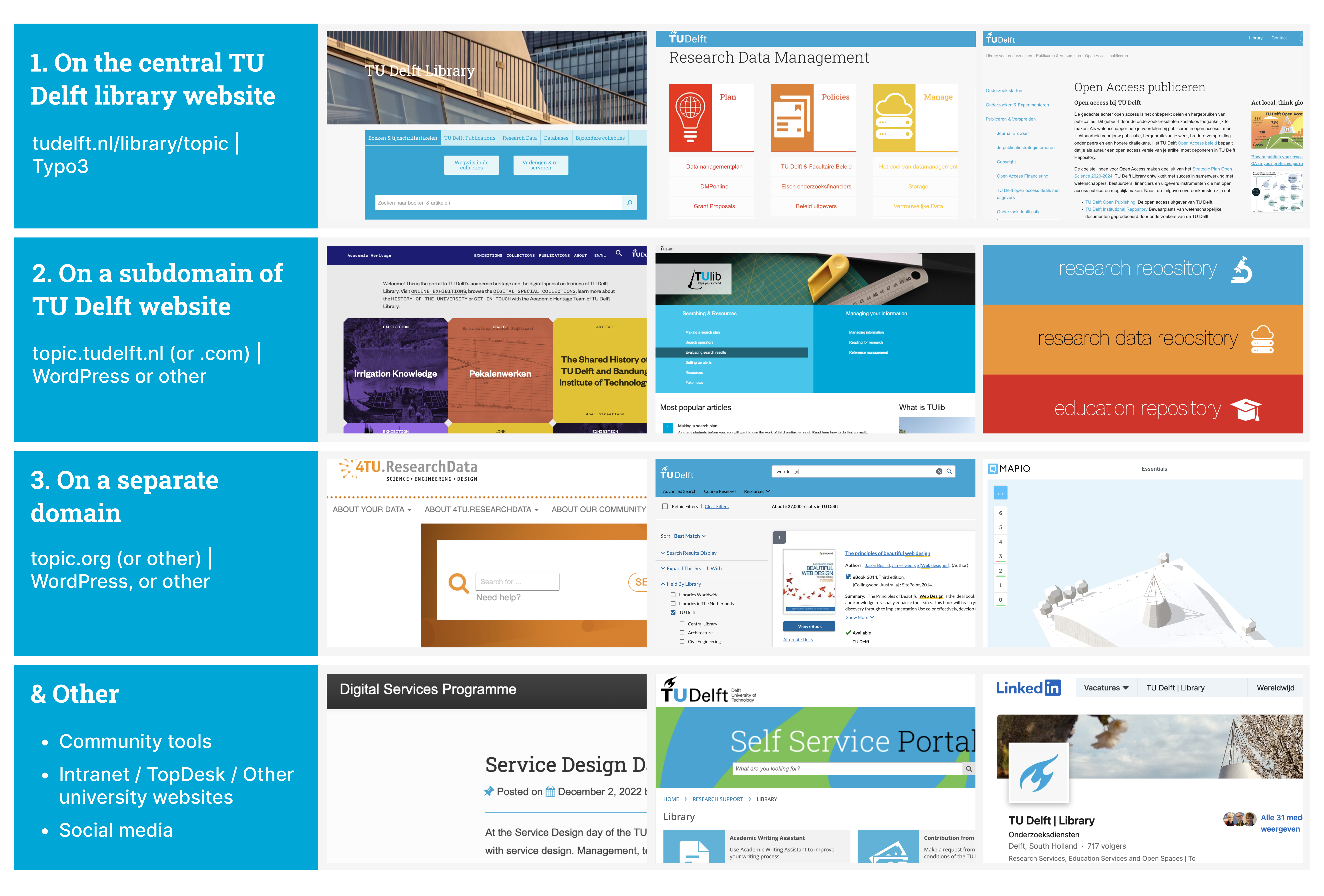
( Screenshots in Figure 3 from top left, to bottom right: 1. Library homepage, 2. Research data management, 3. Open access publishing, 4. Academic heritage, 5. TUlib: An information literacy guide, 6. TU Delft repository, 7. 4TU research Data repository, 8. Library catalogue, 9. Mapiq room booking software, 10. Library digital service program blog, 11. TU Delft TopDesk, 12. Library LinkedIn)
To enhance the findability and cohesion of our services and increase the overall accessibility and user friendliness of our websites we aim to develop design guidelines and patterns for these different types of channels.
During the workshop, participants reflected on how their service website, or webpage fit into the channels, and what level of design integration with the central library website they ideally envision for their service. Do they want to be integrated in the central library’s information structure and follow the design patterns for navigation and content design, or do they need their own? Do they want to follow the libraries visual brand design, or do they want to present their own service brand with affiliation to the library?
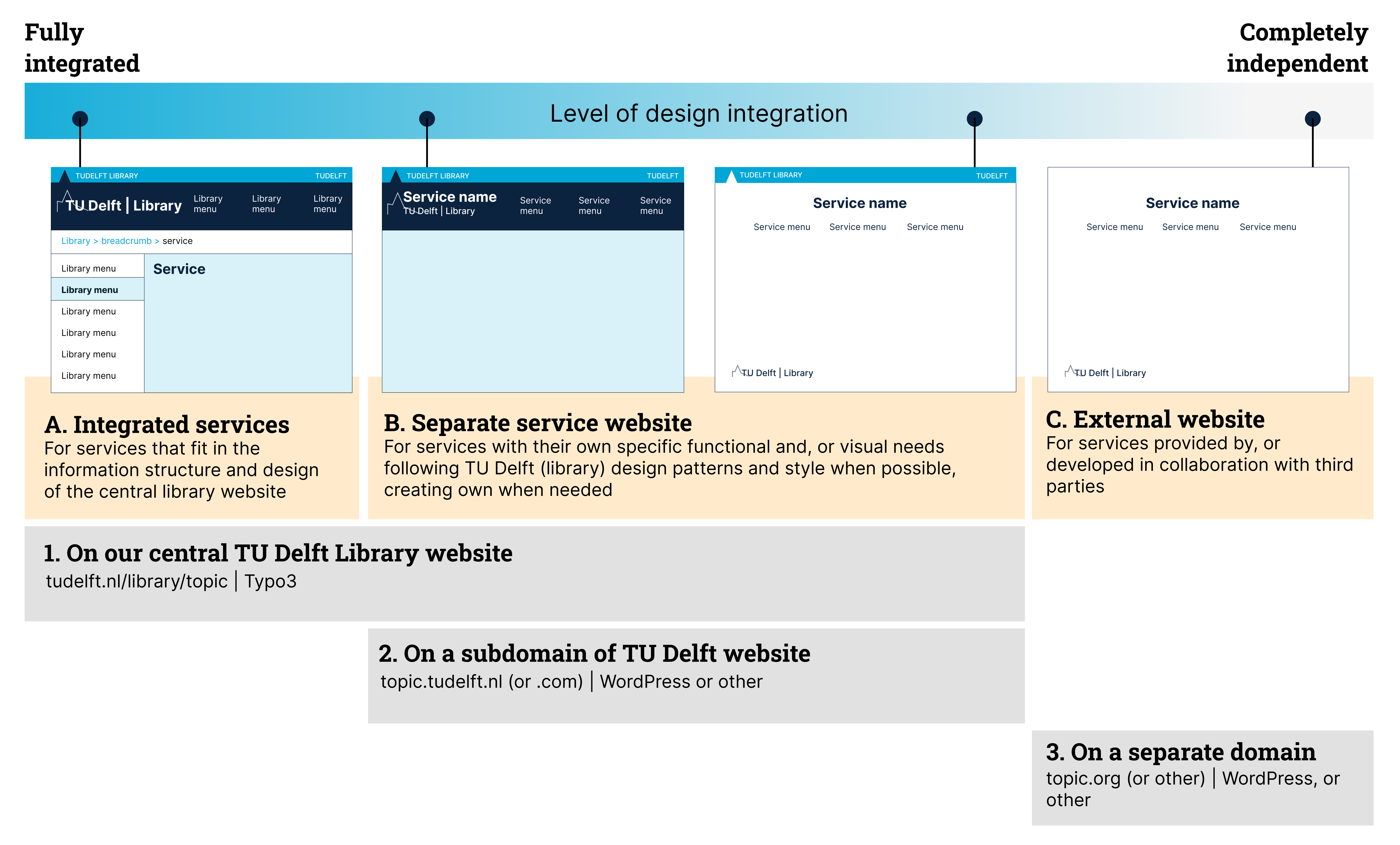
Some insights from the reflection and discussion:
- In general, the vision of accommodating different levels of design integration seem to cover the diverse needs of our services. Some services can fit and be integrated while other services have their own specific information structure, functional, or visual needs, or want to be branded more independently, for example to contribute to research ownership. But they also feel it is beneficial to connect with the central library website as it provides wayfinding, support, and guiding information (“How to guides”) for their services.
- URL and URL structure is an important factor for findability. Even though the channel of the Central TU Delft Website can offer shortened URL’s, some service owners mentioned they would rather choose a subdomain of TU Delft only to have their keyword in front.
- Strategic policy and guidelines need to be made to help position our services on the different channels taking factors like compatibility, editability, flexibility and technical support into account. Do we keep supporting all platforms, or do we move towards the use of one central platform as much as possible? We recognize there will always be functional and organizational exceptions that will require a different platform.
- Other topics mentioned:
- Increase the visibility of our customer service both on our central library website, as well as on our separate service websites.
- Our information is sitting on many different websites, also managed outside of our own organization. How do we keep track of content? Are we working towards university wide integration?
- We are dealing with dynamic content (varying in importance, time relevancy, as well as topic relevancy). How can we ensure the proper visibility for each type of content and how do we keep our content up to date?
These insights will be taken on in the development of a framework that can guide the positioning, design, and branding of our digital services.
Discussion about channels reminded me of my comments about the decentered library presence, and centripetal and centrifugal tendencies. Also that the library presence elsewhere (in channels) tended not to be managed holistically with centered library presence. Interested that you are taking a more unified overview. https://www.lorcandempsey.net/the-decentered-library-network-presence/